Brand Visual
Cartalog.id Visual
Crafted impactful visual designs for Cartalog, including social media campaigns, key visuals, and web banners—turning complex automotive data into clear, engaging content that drives user interaction.
Year :
2024-2025
Industry :
Automotive Tech
Product :
Socmed, Collaterals, Ads, UI
Tools :
Adobe Photoshop & Illustrator

Background & Objectives
Background:
Cartalog is an AI-powered web platform designed to simplify used car price discovery. Beyond its core product experience, the brand required strong visual communication to connect with its audience, educate users about its features, and establish credibility in the competitive automotive market.
Objective:
To create cohesive, high-impact visual assets—from social media content to key visuals and web banners—that effectively translate complex automotive data into clear, engaging, and user-friendly communication.

Exploration
Brand Positioning: Studied Cartalog’s tone and visual identity to ensure every asset aligned with its data-driven yet approachable character.
Content Landscape: Reviewed competitor social media and industry benchmarks to identify visual gaps and opportunities for differentiation.
Audience Behavior: Assessed user interaction trends to determine which visual formats (illustrations, infographics, carousels) perform best for automotive content.
Challenge
Finding relevant benchmarks was a major challenge, as there were no direct local references for an AI-driven platform that summarizes used car pricing data. To overcome this, I expanded my research scope by:
Analyzing data-driven content from news outlets and industry reports to understand how complex information can be visualized clearly.
Exploring sports car communities for high-quality automotive visuals that capture user attention.
Studying data visualization trends on social media to learn how to present analytical content in a way that is both informative and engaging.
This exploration phase allowed me to develop a hybrid visual approach—blending data-centric clarity with automotive aesthetics—that positioned Cartalog as both credible and appealing.
Below is the Link Preview Banner designed to ensure Cartalog’s shared links stand out and maintain a consistent visual identity across platforms.

Execution
Bringing Cartalog’s visual identity to life required cohesive design work across multiple touchpoints. I crafted adaptable visuals that evolved with the brand while maintaining a consistent, user-focused design language.
Cartalog logo motion.
Phase 1: Establishing the Bluish Identity
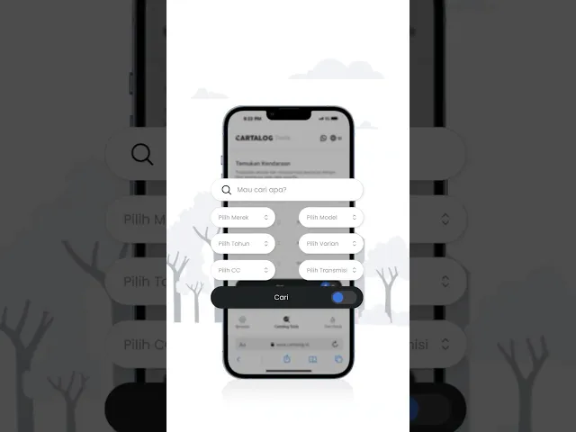
During Cartalog’s launch phase, I developed a cohesive visual foundation centered on clean blue-toned illustrations. These visuals extended across web banners, empty states, and social media content, ensuring a unified design language that introduced the platform with clarity and consistency.
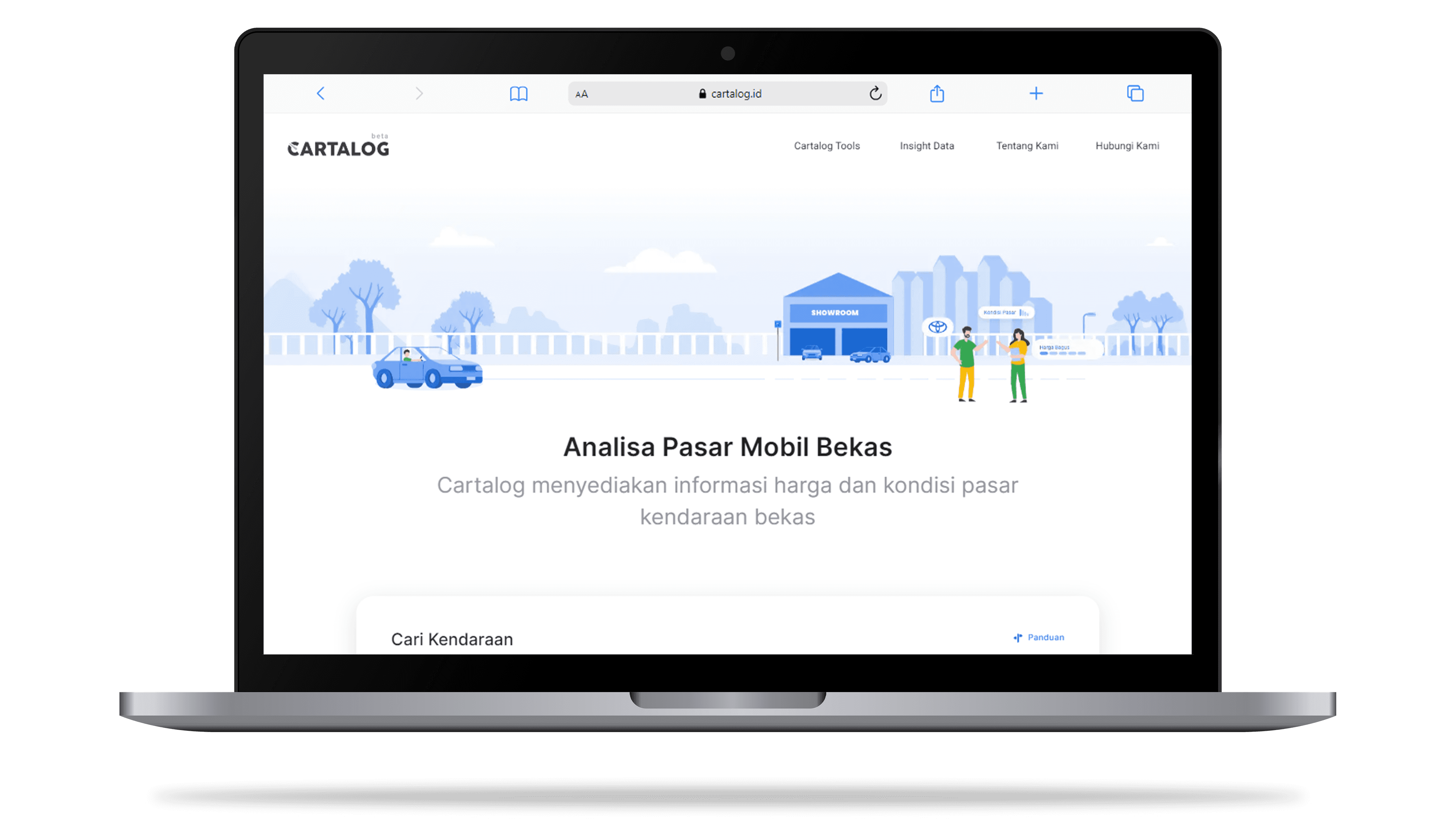
Bluish web banners built to match Cartalog’s early illustration-based identity.
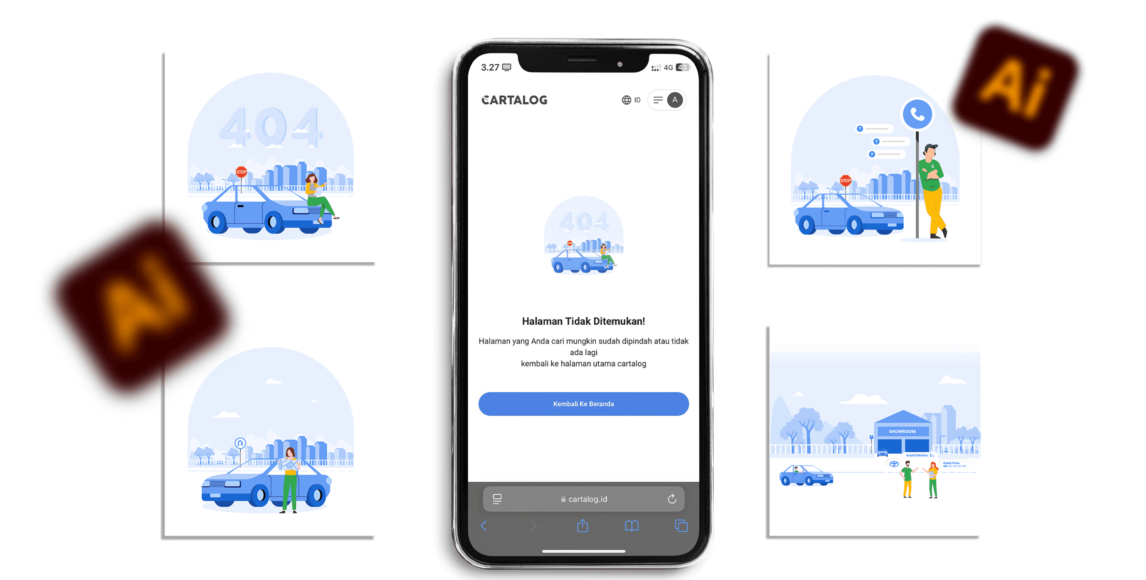
Custom empty states designed to guide users through data-driven features with clarity and consistency.

Social media graphics crafted in the same visual language to reinforce brand cohesion during the launch phase.
Animated launch teaser to drive awareness and establish Cartalog’s initial brand voice.
Phase 2: Transition to a Bold & Mature Visual Direction
As the platform grew, the visual approach evolved to better match Cartalog’s target audience—predominantly male professionals seeking reliable automotive data. I replaced playful illustration styles with a darker, photo-driven look, shifting both the website and social media content toward a more authoritative, data-focused aesthetic.
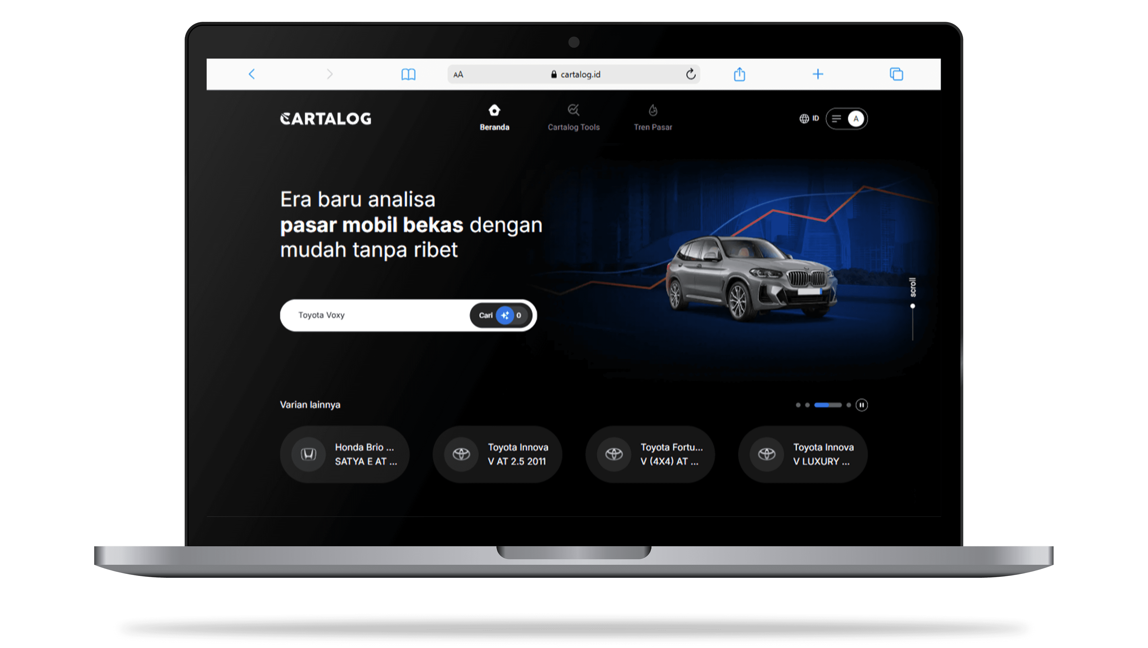
Revamped banners with high-contrast, photo-driven visuals to better align with Cartalog’s male-dominated target audience.

Shifted social content toward darker, more serious tones featuring automotive photography and real market data.
Phase 3: Visual Consistency Across Platforms
The final phase focused on reinforcing visual consistency across all digital touchpoints. I ensured the new design language was applied seamlessly, creating a cohesive experience from the website to social channels while introducing scalable graphic elements for long-term use.
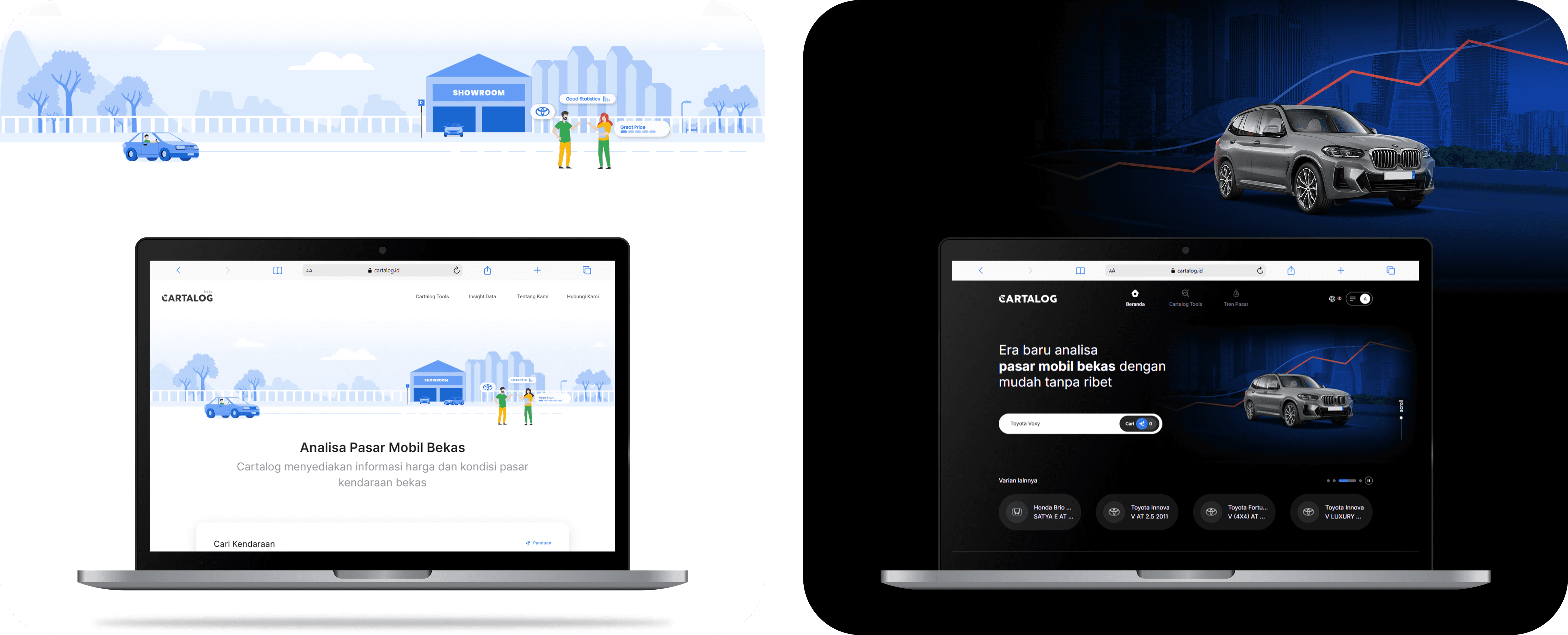
From illustration-based identity to bold photo-driven visuals — ensuring a seamless transition across web and social platforms.
Following the web revamp, I extended this updated visual direction into Cartalog’s social media content, particularly for daily price chart templates. These templates, originally built around the platform’s first bluish aesthetic, were redesigned to match the darker, more data-focused identity, ensuring a unified brand experience across every channel.
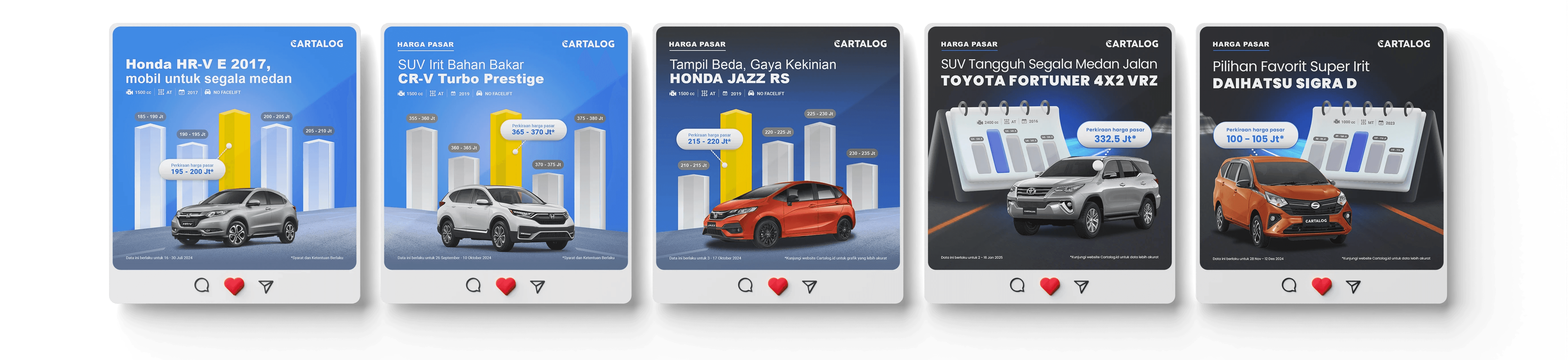
Translating the new visual language to social media price chart templates, aligning with Cartalog’s updated data-driven identity.

This execution phase not only established a cohesive visual system for Cartalog’s platform but also extended its impact across digital touchpoints, from web banners to social media. Each design decision was driven by clarity, consistency, and scalability — ensuring that every asset worked together to reinforce the brand’s identity.
For a deeper look into the complete social media creatives, motion graphics, visit the full project on
Impact & Contributions
By delivering a cohesive visual system and consistent social media designs, I contributed to strengthening Cartalog’s brand presence across multiple platforms. My work resulted in:
Organic Social User Acquisition: Increased the platform’s visibility and attracted new users organically through visually compelling campaigns.
Content Volume: Produced over 240+ design assets, including carousel posts and motion graphics to maintain a consistent brand narrative.

These design contributions didn’t just enhance the platform’s look — they also supported Cartalog’s overall user experience. For a deeper dive into how I approached Cartalog’s UX,

More Projects


Brand Visual
Cartalog.id Visual
Crafted impactful visual designs for Cartalog, including social media campaigns, key visuals, and web banners—turning complex automotive data into clear, engaging content that drives user interaction.
Year :
2024-2025
Industry :
Automotive Tech
Product :
Socmed, Collaterals, Ads, UI
Tools :
Adobe Photoshop & Illustrator
Background & Objectives
Background:
Cartalog is an AI-powered web platform designed to simplify used car price discovery. Beyond its core product experience, the brand required strong visual communication to connect with its audience, educate users about its features, and establish credibility in the competitive automotive market.
Objective:
To create cohesive, high-impact visual assets—from social media content to key visuals and web banners—that effectively translate complex automotive data into clear, engaging, and user-friendly communication.
Exploration
Brand Positioning: Studied Cartalog’s tone and visual identity to ensure every asset aligned with its data-driven yet approachable character.
Content Landscape: Reviewed competitor social media and industry benchmarks to identify visual gaps and opportunities for differentiation.
Audience Behavior: Assessed user interaction trends to determine which visual formats (illustrations, infographics, carousels) perform best for automotive content.
Challenge
Finding relevant benchmarks was a major challenge, as there were no direct local references for an AI-driven platform that summarizes used car pricing data. To overcome this, I expanded my research scope by:
Analyzing data-driven content from news outlets and industry reports to understand how complex information can be visualized clearly.
Exploring sports car communities for high-quality automotive visuals that capture user attention.
Studying data visualization trends on social media to learn how to present analytical content in a way that is both informative and engaging.
This exploration phase allowed me to develop a hybrid visual approach—blending data-centric clarity with automotive aesthetics—that positioned Cartalog as both credible and appealing.
Below is the Link Preview Banner designed to ensure Cartalog’s shared links stand out and maintain a consistent visual identity across platforms.
Execution
Bringing Cartalog’s visual identity to life required cohesive design work across multiple touchpoints. I crafted adaptable visuals that evolved with the brand while maintaining a consistent, user-focused design language.
Cartalog logo motion.
Phase 1: Establishing the Bluish Identity
During Cartalog’s launch phase, I developed a cohesive visual foundation centered on clean blue-toned illustrations. These visuals extended across web banners, empty states, and social media content, ensuring a unified design language that introduced the platform with clarity and consistency.
Bluish web banners built to match Cartalog’s early illustration-based identity.
Custom empty states designed to guide users through data-driven features with clarity and consistency.
Social media graphics crafted in the same visual language to reinforce brand cohesion during the launch phase.
Animated launch teaser to drive awareness and establish Cartalog’s initial brand voice.
Phase 2: Transition to a Bold & Mature Visual Direction
As the platform grew, the visual approach evolved to better match Cartalog’s target audience—predominantly male professionals seeking reliable automotive data. I replaced playful illustration styles with a darker, photo-driven look, shifting both the website and social media content toward a more authoritative, data-focused aesthetic.
Revamped banners with high-contrast, photo-driven visuals to better align with Cartalog’s male-dominated target audience.
Shifted social content toward darker, more serious tones featuring automotive photography and real market data.
Phase 3: Visual Consistency Across Platforms
The final phase focused on reinforcing visual consistency across all digital touchpoints. I ensured the new design language was applied seamlessly, creating a cohesive experience from the website to social channels while introducing scalable graphic elements for long-term use.
From illustration-based identity to bold photo-driven visuals — ensuring a seamless transition across web and social platforms.
Following the web revamp, I extended this updated visual direction into Cartalog’s social media content, particularly for daily price chart templates. These templates, originally built around the platform’s first bluish aesthetic, were redesigned to match the darker, more data-focused identity, ensuring a unified brand experience across every channel.
Translating the new visual language to social media price chart templates, aligning with Cartalog’s updated data-driven identity.
This execution phase not only established a cohesive visual system for Cartalog’s platform but also extended its impact across digital touchpoints, from web banners to social media. Each design decision was driven by clarity, consistency, and scalability — ensuring that every asset worked together to reinforce the brand’s identity.
For a deeper look into the complete social media creatives, motion graphics, visit the full project on
Impact & Contributions
By delivering a cohesive visual system and consistent social media designs, I contributed to strengthening Cartalog’s brand presence across multiple platforms. My work resulted in:
Organic Social User Acquisition: Increased the platform’s visibility and attracted new users organically through visually compelling campaigns.
Content Volume: Produced over 240+ design assets, including carousel posts and motion graphics to maintain a consistent brand narrative.
These design contributions didn’t just enhance the platform’s look — they also supported Cartalog’s overall user experience. For a deeper dive into how I approached Cartalog’s UX,
More Projects
Brand Visual
Cartalog.id Visual
Crafted impactful visual designs for Cartalog, including social media campaigns, key visuals, and web banners—turning complex automotive data into clear, engaging content that drives user interaction.
Year :
2024-2025
Industry :
Automotive Tech
Product :
Socmed, Collaterals, Ads, UI
Tools :
Adobe Photoshop & Illustrator
Background & Objectives
Background:
Cartalog is an AI-powered web platform designed to simplify used car price discovery. Beyond its core product experience, the brand required strong visual communication to connect with its audience, educate users about its features, and establish credibility in the competitive automotive market.
Objective:
To create cohesive, high-impact visual assets—from social media content to key visuals and web banners—that effectively translate complex automotive data into clear, engaging, and user-friendly communication.
Exploration
Brand Positioning: Studied Cartalog’s tone and visual identity to ensure every asset aligned with its data-driven yet approachable character.
Content Landscape: Reviewed competitor social media and industry benchmarks to identify visual gaps and opportunities for differentiation.
Audience Behavior: Assessed user interaction trends to determine which visual formats (illustrations, infographics, carousels) perform best for automotive content.
Challenge
Finding relevant benchmarks was a major challenge, as there were no direct local references for an AI-driven platform that summarizes used car pricing data. To overcome this, I expanded my research scope by:
Analyzing data-driven content from news outlets and industry reports to understand how complex information can be visualized clearly.
Exploring sports car communities for high-quality automotive visuals that capture user attention.
Studying data visualization trends on social media to learn how to present analytical content in a way that is both informative and engaging.
This exploration phase allowed me to develop a hybrid visual approach—blending data-centric clarity with automotive aesthetics—that positioned Cartalog as both credible and appealing.
Below is the Link Preview Banner designed to ensure Cartalog’s shared links stand out and maintain a consistent visual identity across platforms.
Execution
Bringing Cartalog’s visual identity to life required cohesive design work across multiple touchpoints. I crafted adaptable visuals that evolved with the brand while maintaining a consistent, user-focused design language.
Cartalog logo motion.
Phase 1: Establishing the Bluish Identity
During Cartalog’s launch phase, I developed a cohesive visual foundation centered on clean blue-toned illustrations. These visuals extended across web banners, empty states, and social media content, ensuring a unified design language that introduced the platform with clarity and consistency.
Bluish web banners built to match Cartalog’s early illustration-based identity.
Custom empty states designed to guide users through data-driven features with clarity and consistency.
Social media graphics crafted in the same visual language to reinforce brand cohesion during the launch phase.
Animated launch teaser to drive awareness and establish Cartalog’s initial brand voice.
Phase 2: Transition to a Bold & Mature Visual Direction
As the platform grew, the visual approach evolved to better match Cartalog’s target audience—predominantly male professionals seeking reliable automotive data. I replaced playful illustration styles with a darker, photo-driven look, shifting both the website and social media content toward a more authoritative, data-focused aesthetic.
Revamped banners with high-contrast, photo-driven visuals to better align with Cartalog’s male-dominated target audience.
Shifted social content toward darker, more serious tones featuring automotive photography and real market data.
Phase 3: Visual Consistency Across Platforms
The final phase focused on reinforcing visual consistency across all digital touchpoints. I ensured the new design language was applied seamlessly, creating a cohesive experience from the website to social channels while introducing scalable graphic elements for long-term use.
From illustration-based identity to bold photo-driven visuals — ensuring a seamless transition across web and social platforms.
Following the web revamp, I extended this updated visual direction into Cartalog’s social media content, particularly for daily price chart templates. These templates, originally built around the platform’s first bluish aesthetic, were redesigned to match the darker, more data-focused identity, ensuring a unified brand experience across every channel.
Translating the new visual language to social media price chart templates, aligning with Cartalog’s updated data-driven identity.
This execution phase not only established a cohesive visual system for Cartalog’s platform but also extended its impact across digital touchpoints, from web banners to social media. Each design decision was driven by clarity, consistency, and scalability — ensuring that every asset worked together to reinforce the brand’s identity.
For a deeper look into the complete social media creatives, motion graphics, visit the full project on
Impact & Contributions
By delivering a cohesive visual system and consistent social media designs, I contributed to strengthening Cartalog’s brand presence across multiple platforms. My work resulted in:
Organic Social User Acquisition: Increased the platform’s visibility and attracted new users organically through visually compelling campaigns.
Content Volume: Produced over 240+ design assets, including carousel posts and motion graphics to maintain a consistent brand narrative.
These design contributions didn’t just enhance the platform’s look — they also supported Cartalog’s overall user experience. For a deeper dive into how I approached Cartalog’s UX,